Abstract green oval shapes with a black line on beige background

morf

morf

morf

Branding

Visual Design

Morf is a furniture collection where every piece holds more than one function. A coat rack that becomes a lamp. A side table that becomes a desk. The furniture withholds a little. So does the brand. Naming, logo, colour, copy, packaging, voice, all built around one idea: this is furniture worth figuring out.

Morf is a furniture collection where every piece holds more than one function. A coat rack that becomes a lamp. A side table that becomes a desk. The furniture withholds a little. So does the brand. Naming, logo, colour, copy, packaging, voice, all built around one idea: this is furniture worth figuring out.
Project Overview

Project: Morf, a multifunctional furniture collection
The brief: A complete brand identity — naming, logo, colour, copy, packaging, social voice
Duration: 10 weeks (2024)
My Role: Brand identity, copywriting, design system

Morf is built on a quiet idea: deep engagement with an object creates attachment, and attachment is what keeps things out of landfills. Each of the seven pieces holds more than one function and hides the second until you find it. The brand had to do what the furniture does, without ever saying so.

Project Overview

Project: Morf, a multifunctional furniture collection
The brief: A complete brand identity — naming, logo, colour, copy, packaging, social voice
Duration: 10 weeks (2024)
My Role: Brand identity, copywriting, design system

Morf is built on a quiet idea: deep engagement with an object creates attachment, and attachment is what keeps things out of landfills. Each of the seven pieces holds more than one function and hides the second until you find it. The brand had to do what the furniture does, without ever saying so.

My Role
Brand Strategy & Identity
— Built the conceptual foundation first: positioned the collection around discovery over instruction, then translated that into a name, a logo system that shifts across states, and a four-colour palette drawn from the objects rather than a trend board.

Copy & Verbal Identity — Authored the brand's entire voice that sells the relationship instead of the feature. Set the tone rules that keep every future line on-brand.

Design System — Engineered the rules that let one identity flex across packaging, web, motion, and campaign without fracturing — deciding what stays load-bearing and what's free to move, so the system can grow in other hands.

My Role
Brand Strategy & Identity
— Built the conceptual foundation first: positioned the collection around discovery over instruction, then translated that into a name, a logo system that shifts across states, and a four-colour palette drawn from the objects rather than a trend board.

Copy & Verbal Identity — Authored the brand's entire voice that sells the relationship instead of the feature. Set the tone rules that keep every future line on-brand.

Design System — Engineered the rules that let one identity flex across packaging, web, motion, and campaign without fracturing — deciding what stays load-bearing and what's free to move, so the system can grow in other hands.

7 Pieces 

Diverge, Tain, Arise, Fuse, Cascade, Swerve, Align

7 Pieces 

Diverge, Tain, Arise, Fuse, Cascade, Swerve, Align

4 Colors 

Pulled from the objects themselves, not a mood board.

4 Colors 

Pulled from the objects themselves, not a mood board.

1 Tagline 

The longer you look, the more you find.

1 Tagline 

The longer you look, the more you find.
THE INSIGHT
Most furniture tells you exactly what it is. Morf asks you to figure it out.

The insight

The furniture industry defaults to clarity — functional names, feature copy, the object shot from its most legible angle. Morf does the opposite. Each piece withholds its second function until you find it, and the person who discovers it feels something a passive consumer never does: ownership.

The philosophy comes from two sources — Jonathan Chapman's emotionally durable design, where engagement builds attachment and attachment prevents waste, and the Indian concept of Jugaad, seeing more possibility in something than its obvious use. Both land on the same truth: the lasting relationship between a person and an object is built on discovery, not instruction.

THE INSIGHT
Most furniture tells you exactly what it is. Morf asks you to figure it out.

The insight

The furniture industry defaults to clarity — functional names, feature copy, the object shot from its most legible angle. Morf does the opposite. Each piece withholds its second function until you find it, and the person who discovers it feels something a passive consumer never does: ownership.

The philosophy comes from two sources — Jonathan Chapman's emotionally durable design, where engagement builds attachment and attachment prevents waste, and the Indian concept of Jugaad, seeing more possibility in something than its obvious use. Both land on the same truth: the lasting relationship between a person and an object is built on discovery, not instruction.

THE NAME AND LOGO

Morf. 

/môrf/ ~undergo or cause to undergo a gradual process of transformation. Morf is a verb before it's a name. To morf is what these objects do when you're not looking. Naming the collection after the motion rather than the object felt truer to what it is: never a fixed noun, always something in the middle of becoming.

The logo as a system

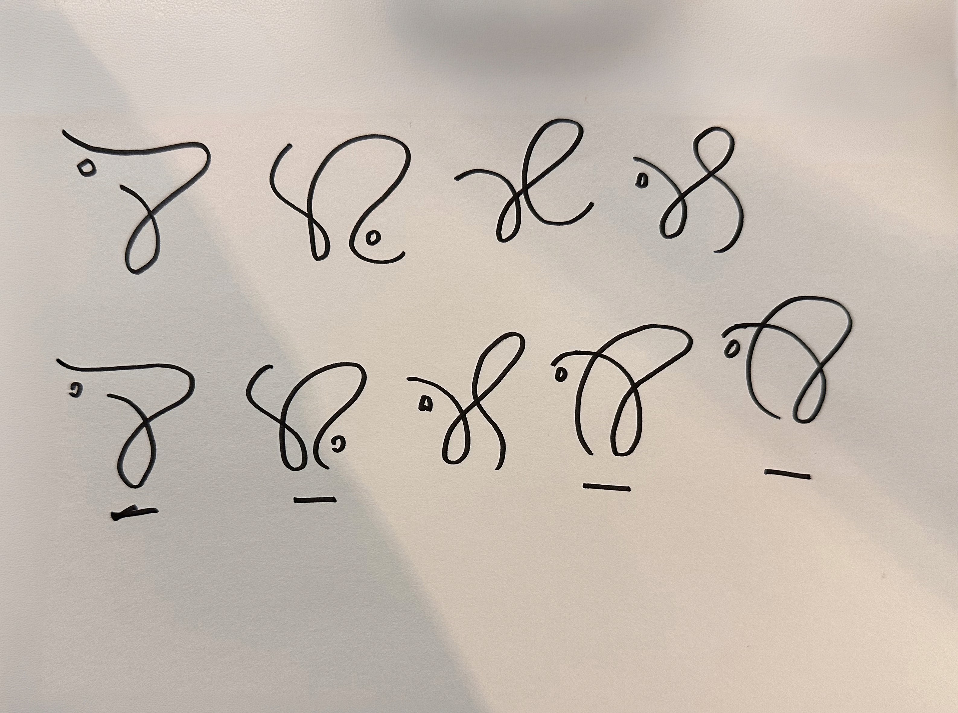
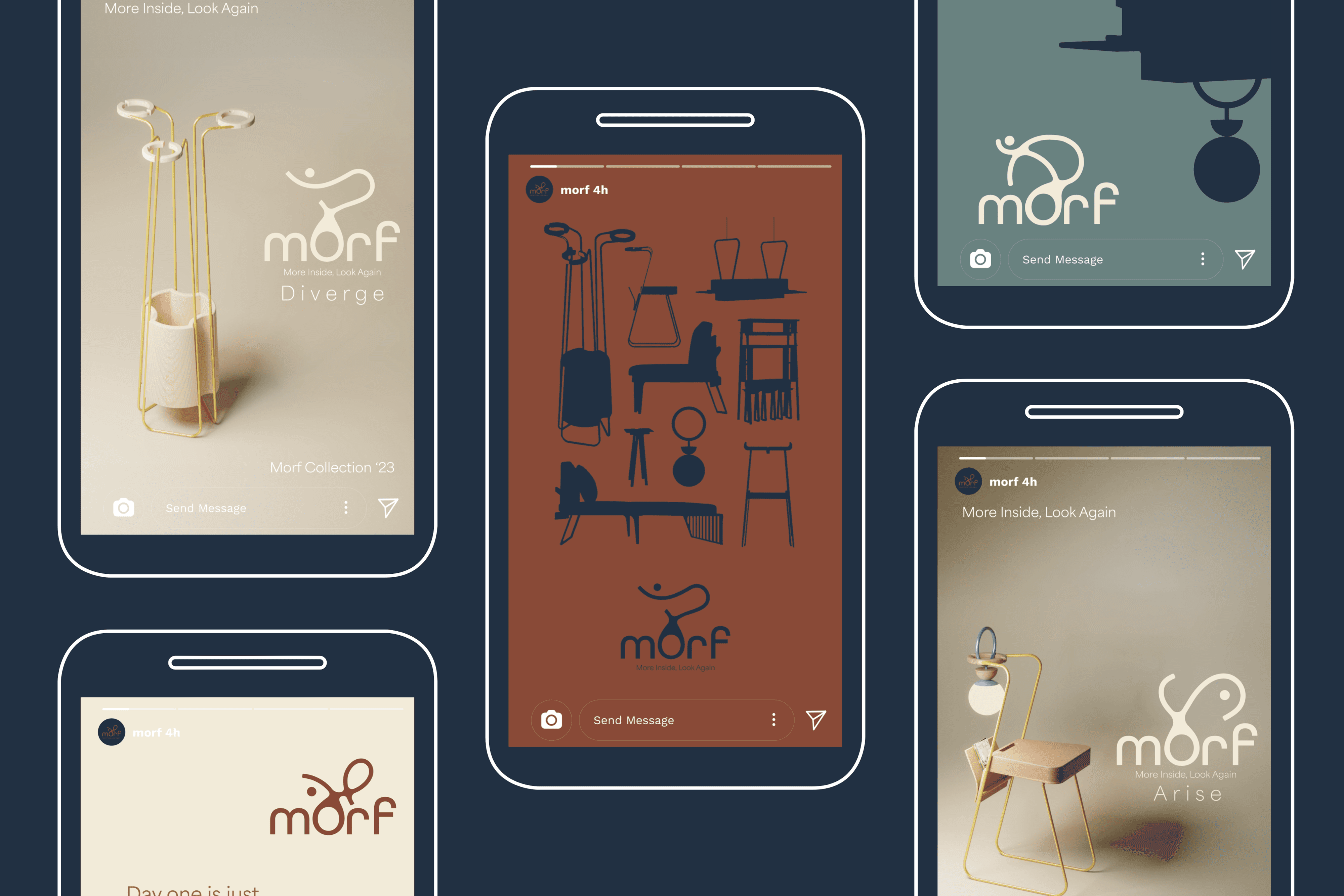
Rather than one fixed logomark, the logo exists in a dynamic state — One line, drawn in a single breath, never lifting. It follows the contour of the pieces and doesn't stop there. The whole collection caught in one continuous gesture, the way each object slips from one life into the next without ever pausing to announce it. It carries the unbroken stroke of Devanagari calligraphy, a line that has always known how to flow. And it never settles — because how else do you draw a collection that refuses to hold still? Beneath it, Area Normal stands quiet and unmoving. The mark dances; the type holds the floor.

THE NAME AND LOGO

Morf. 

/môrf/ ~undergo or cause to undergo a gradual process of transformation. Morf is a verb before it's a name. To morf is what these objects do when you're not looking. Naming the collection after the motion rather than the object felt truer to what it is: never a fixed noun, always something in the middle of becoming.

The logo as a system

Rather than one fixed logomark, the logo exists in a dynamic state — One line, drawn in a single breath, never lifting. It follows the contour of the pieces and doesn't stop there. The whole collection caught in one continuous gesture, the way each object slips from one life into the next without ever pausing to announce it. It carries the unbroken stroke of Devanagari calligraphy, a line that has always known how to flow. And it never settles — because how else do you draw a collection that refuses to hold still? Beneath it, Area Normal stands quiet and unmoving. The mark dances; the type holds the floor.

THE VOICE

It talks the way you'd describe something you love without overselling it. Warm. Unhurried. A little conspiratorial. It never once says sustainable — that would break the spell, and you already understood. It just leans in: the longer you look, the more you find. Part description, part promise, part quiet argument against ever throwing the thing away.

KEY LEARNINGS

I started by making the brand prettier. I ended by making it honest. Morf the collection is slow, material, patient — it hands you something and waits for you to discover the rest. The identity I inherited did the opposite: fast, clever, explaining everything before you'd touched a single piece. The fix wasn't visual. It was realizing this brand isn't trying to sell furniture — it's trying to start a relationship. So it had to stop pitching and start introducing. Everything else followed from that.

THE VOICE

It talks the way you'd describe something you love without overselling it. Warm. Unhurried. A little conspiratorial. It never once says sustainable — that would break the spell, and you already understood. It just leans in: the longer you look, the more you find. Part description, part promise, part quiet argument against ever throwing the thing away.

KEY LEARNINGS

I started by making the brand prettier. I ended by making it honest. Morf the collection is slow, material, patient — it hands you something and waits for you to discover the rest. The identity I inherited did the opposite: fast, clever, explaining everything before you'd touched a single piece. The fix wasn't visual. It was realizing this brand isn't trying to sell furniture — it's trying to start a relationship. So it had to stop pitching and start introducing. Everything else followed from that.

Slide 1 of 1
Slide 1 of 1
Slide 1 of 1